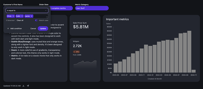
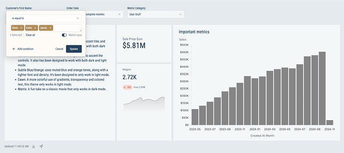
Recently Omni demoed some fun seasonal themes to show off the additional dashboard theming capabilities. I thought it’d be fun to share additional variations to demonstrate how the exact same content can get a totally different look. Along with screenshots, I’ve included the code for each theme.
To use any of these themes as a jumping off point, you can use the “Import” button at the bottom-left of a new theme and paste the code.
If you’ve built something fun and want to share, post your theme values in a comment. You can easily grab your theme code by using the “Generate” button at the bottom left of the theme:
Tile Accent Color
This theme uses shades of a single color to accent tiles and inside of the controls. It has been designed to work with both dark and light mode.
{
  "dashboard-key-color": "rgb(86,44,221)",
  "dashboard-background": "rgba(86,44,221,.02)",
  "dashboard-tile-margin": "20px",
  "dashboard-tile-shadow": "0px -4px 0px rgba(86,44,221,1)",
  "dashboard-button-radius": "0",
  "dashboard-control-radius": "0",
  "dashboard-key-text-color": "white",
  "dashboard-tile-border-color": "",
  "dashboard-tile-border-width": "0",
  "dashboard-tile-border-radius": "0",
  "dashboard-filter-input-radius": "0",
  "dashboard-control-border-color": "var(--color-border1)",
  "dashboard-control-outline-color": "rgba(86,44,221)",
  "dashboard-control-popover-radius": "0",
  "dashboard-filter-input-token-color": "rgba(147,120,232,0.2)",
  "dashboard-filter-input-accent-color": "rgba(86,44,221,1)",
  "dashboard-filter-input-border-color": "var(--color-border1)",
  "dashboard-control-popover-link-color": "var(--color-text4)",
  "dashboard-filter-input-outline-color": "rgb(147,120,232)",
  "dashboard-menu-item-interactive-color": "rgba(86,44,221,0.1)",
  "dashboard-button-transparent-text-color": "",
  "dashboard-filter-input-accent-invert-color": "white",
  "dashboard-button-transparent-interactive-color": "rgba(147,120,232,0.2)"
}
Control Accent Color
This theme uses shades of a single color to accent the controls. It also has been designed to work with both dark and light mode.
{
  "dashboard-key-color": "rgb(86, 44, 221)",
  "dashboard-background": "var(--color-background)",
  "dashboard-tile-shadow": "",
  "dashboard-button-radius": "",
  "dashboard-control-radius": "16px",
  "dashboard-key-text-color": "white",
  "dashboard-tile-background": "var(--color-foreground2)",
  "dashboard-tile-border-color": "",
  "dashboard-tile-border-style": "",
  "dashboard-tile-border-width": "0",
  "dashboard-control-background": "rgb(86, 44, 221)",
  "dashboard-control-text-color": "white",
  "dashboard-tile-border-radius": "20px",
  "dashboard-control-label-color": "",
  "dashboard-filter-input-radius": "8px",
  "dashboard-control-border-color": "transparent",
  "dashboard-tile-title-font-size": "",
  "dashboard-control-outline-color": "var(--color-text4)",
  "dashboard-tile-title-text-color": "",
  "dashboard-control-popover-radius": "16px",
  "dashboard-tile-title-font-family": "",
  "dashboard-filter-input-background": "",
  "dashboard-filter-input-text-color": "",
  "dashboard-filter-input-token-color": "rgb(86, 44, 221)",
  "dashboard-filter-input-accent-color": "rgb(86, 44, 221)",
  "dashboard-filter-input-border-color": "",
  "dashboard-control-popover-background": "var(--color-background-alt)",
  "dashboard-control-popover-link-color": "var(--color-text4)",
  "dashboard-control-popover-text-color": "",
  "dashboard-filter-input-outline-color": "rgb(147, 120, 232)",
  "dashboard-tile-text-body-font-family": "",
  "dashboard-control-popover-border-color": "var(--color-border4)",
  "dashboard-button-transparent-text-color": "",
  "dashboard-control-popover-divider-color": "",
  "dashboard-filter-input-token-text-color": "white",
  "dashboard-filter-input-placeholder-color": "",
  "dashboard-filter-input-accent-invert-color": "white",
  "dashboard-button-transparent-interactive-color": ""
}
Subtle Blue/Orange
This theme uses muted blue and orange tones, along with a tighter font and density. It’s been designed to only work in light mode.
{
  "dashboard-key-color": "#164362",
  "dashboard-background": "#E3EAEE",
  "dashboard-tile-margin": "2px",
  "dashboard-tile-shadow": "none",
  "dashboard-button-radius": "3px",
  "dashboard-control-radius": "3px",
  "dashboard-key-text-color": "white",
  "dashboard-tile-background": "rgba(255,255,255,0.6)",
  "dashboard-tile-border-color": "rgba(0,0,0,0.1)",
  "dashboard-tile-border-style": "solid",
  "dashboard-tile-border-width": "1px",
  "dashboard-control-background": "rgba(255,255,255,0.6)",
  "dashboard-control-text-color": "#164362",
  "dashboard-tile-border-radius": "3px",
  "dashboard-control-label-color": "#164362",
  "dashboard-filter-input-radius": "3px",
  "dashboard-control-border-color": "rgba(0,0,0,0.1)",
  "dashboard-tile-text-body-color": "#164362",
  "dashboard-tile-title-font-size": "18px",
  "dashboard-control-outline-color": "#6C8494",
  "dashboard-tile-title-text-color": "#164362",
  "dashboard-control-popover-radius": "3px",
  "dashboard-tile-title-font-family": "url(https://fonts.gstatic.com/s/robotocondensed/v27/ieVl2ZhZI2eCN5jzbjEETS9weq8-19K7DQk6YvM.woff2)",
  "dashboard-tile-title-font-weight": "",
  "dashboard-filter-input-background": "rgba(255,255,255,0.6)",
  "dashboard-filter-input-icon-color": "#164362",
  "dashboard-filter-input-text-color": "#164362",
  "dashboard-filter-input-token-color": "#B78A4E",
  "dashboard-control-placeholder-color": "#8C9DA9",
  "dashboard-filter-input-accent-color": "#164362",
  "dashboard-filter-input-border-color": "rgba(0,0,0,0.1)",
  "dashboard-tile-text-secondary-color": "#6C8494",
  "dashboard-control-popover-background": "#FFFBF5",
  "dashboard-control-popover-link-color": "#164362",
  "dashboard-control-popover-text-color": "#164362",
  "dashboard-filter-input-outline-color": "#B78A4E",
  "dashboard-tile-text-body-font-family": "url(https://fonts.gstatic.com/s/robotocondensed/v27/ieVl2ZhZI2eCN5jzbjEETS9weq8-19K7DQk6YvM.woff2)",
  "dashboard-tile-text-code-font-family": "url(https://fonts.gstatic.com/s/robotomono/v23/L0x5DF4xlVMF-BfR8bXMIjhLq3-cXbKD.woff2)",
  "dashboard-menu-item-interactive-color": "#F7E5CD",
  "dashboard-control-popover-border-color": "rgba(0,0,0,0.3)",
  "dashboard-button-transparent-text-color": "#164362",
  "dashboard-control-popover-divider-color": "rgba(0,0,0,0.1)",
  "dashboard-filter-input-token-text-color": "white",
  "dashboard-filter-input-placeholder-color": "#8C9DA9",
  "dashboard-filter-input-accent-invert-color": "white",
  "dashboard-button-transparent-interactive-color": "#F7E5CD",
  "dashboard-control-popover-secondary-text-color": "#8C9DA9"
}
Dawn
A more colorful use of gradients, transparency, and colored text, this theme only works in light mode.
{
  "dashboard-key-color": "white",
  "dashboard-background": "linear-gradient(113deg, rgba(255, 187, 215, 0.34) 0.02%, rgba(255, 195, 126, 0.34) 99.98%)",
  "dashboard-tile-shadow": "0 1px 3px rgba(119, 8, 48, 0.075)",
  "dashboard-button-radius": "10px",
  "dashboard-control-radius": "5px",
  "dashboard-key-text-color": "#770830",
  "dashboard-tile-background": "rgba(255, 255, 255, 0.6)",
  "dashboard-tile-border-color": "rgba(119, 8, 48, 0.15)",
  "dashboard-tile-border-style": "solid",
  "dashboard-tile-border-width": "1px",
  "dashboard-control-background": "rgba(255, 255, 255, 0.6)",
  "dashboard-control-text-color": "#770830",
  "dashboard-tile-border-radius": "15px",
  "dashboard-control-label-color": "#770830",
  "dashboard-filter-input-radius": "5px",
  "dashboard-control-border-color": "rgba(119, 8, 48, 0.15)",
  "dashboard-tile-text-body-color": "#770830",
  "dashboard-control-outline-color": "#D391A8",
  "dashboard-tile-title-text-color": "#770830",
  "dashboard-control-popover-radius": "5px",
  "dashboard-tile-title-font-family": "url(https://fonts.gstatic.com/s/suse/v1/MwQsbhb078Wt81NpzELmC2QqjbFh6Wq6bHNwY8QHhKU.woff2) format('woff2')",
  "dashboard-tile-title-font-weight": "800",
  "dashboard-filter-input-background": "rgba(255,255,255,0.6)",
  "dashboard-filter-input-icon-color": "#770830",
  "dashboard-filter-input-text-color": "#770830",
  "dashboard-filter-input-token-color": "white linear-gradient(113deg, rgba(255, 187, 215, 0.34) 0.02%, rgba(255, 195, 126, 0.34) 99.98%)",
  "dashboard-control-placeholder-color": "#D391A8",
  "dashboard-filter-input-accent-color": "#770830",
  "dashboard-filter-input-border-color": "rgba(119, 8, 48, 0.15)",
  "dashboard-tile-text-secondary-color": "#D391A8",
  "dashboard-control-popover-background": "white linear-gradient(113deg, rgba(255, 187, 215, 0.34) 0.02%, rgba(255, 195, 126, 0.34) 99.98%)",
  "dashboard-control-popover-link-color": "#770830",
  "dashboard-control-popover-text-color": "#770830",
  "dashboard-filter-input-outline-color": "#D391A8",
  "dashboard-menu-item-interactive-color": "rgba(255, 255, 255, 0.4)",
  "dashboard-control-popover-border-color": "rgba(119, 8, 48, 0.15)",
  "dashboard-button-transparent-text-color": "#770830",
  "dashboard-filter-input-token-text-color": "#770830",
  "dashboard-filter-input-placeholder-color": "#D391A8",
  "dashboard-filter-input-accent-invert-color": "white",
  "dashboard-button-transparent-interactive-color": "rgba(255,255,255,0.4)",
  "dashboard-control-popover-secondary-text-color": "#D391A8"
}
Matrix
A fun take on a classic movie that only works in dark mode.
{
  "dashboard-key-color": "#60C645",
  "dashboard-background": "linear-gradient(rgba(0, 0, 0, 0.85) 0%, rgba(0, 0, 0, 1) 100%),  url(\"https://t4.ftcdn.net/jpg/04/23/79/35/360_F_423793519_NZNch45zsOet1LGq39tFWCfAFAGb5BJI.jpg\") top left / cover no-repeat",
  "dashboard-tile-margin": "2.5px",
  "dashboard-tile-shadow": "",
  "dashboard-button-radius": "0",
  "dashboard-control-radius": "0",
  "dashboard-key-text-color": "black",
  "dashboard-tile-background": "rgba(0,0,0,0.5)",
  "dashboard-tile-border-color": "rgba(96,198,69,.15)",
  "dashboard-tile-border-width": "",
  "dashboard-control-background": "rgba(0,0,0,0.5)",
  "dashboard-control-text-color": "#60C645",
  "dashboard-tile-border-radius": "0",
  "dashboard-control-label-color": "#60C645",
  "dashboard-filter-input-radius": "0",
  "dashboard-control-border-color": "rgba(96,198,69,.15)",
  "dashboard-tile-text-body-color": "#60C645",
  "dashboard-tile-title-font-size": "18px",
  "dashboard-control-outline-color": "#60C645",
  "dashboard-tile-title-text-color": "#60C645",
  "dashboard-control-popover-radius": "0",
  "dashboard-tile-title-font-family": "url(https://fonts.gstatic.com/s/synemono/v15/K2FzfZNHj_FHBmRbFvHDJaqlLSj6ZQ.woff2)",
  "dashboard-filter-input-background": "black",
  "dashboard-filter-input-icon-color": "#60C645",
  "dashboard-filter-input-text-color": "#60C645",
  "dashboard-filter-input-token-color": "rgba(96,198,69,.15)",
  "dashboard-control-placeholder-color": "rgba(96,198,69,.5)",
  "dashboard-filter-input-accent-color": "#60C645",
  "dashboard-filter-input-border-color": "rgba(96,198,69,.15)",
  "dashboard-tile-text-secondary-color": "#60C645",
  "dashboard-control-popover-background": "black",
  "dashboard-control-popover-link-color": "#60C645",
  "dashboard-control-popover-text-color": "#60C645",
  "dashboard-filter-input-outline-color": "#60C645",
  "dashboard-tile-text-body-font-family": "url(https://fonts.gstatic.com/s/synemono/v15/K2FzfZNHj_FHBmRbFvHDJaqlLSj6ZQ.woff2)",
  "dashboard-tile-text-code-font-family": "url(https://fonts.gstatic.com/s/synemono/v15/K2FzfZNHj_FHBmRbFvHDJaqlLSj6ZQ.woff2)",
  "dashboard-menu-item-interactive-color": "rgba(96,198,69,.25)",
  "dashboard-control-popover-border-color": "rgba(96,198,69,.5)",
  "dashboard-button-transparent-text-color": "#60C645",
  "dashboard-filter-input-token-text-color": "#60C645",
  "dashboard-filter-input-placeholder-color": "rgba(96,198,69,.5)",
  "dashboard-filter-input-accent-invert-color": "black",
  "dashboard-button-transparent-interactive-color": "rgba(96,198,69,.25)",
  "dashboard-control-popover-secondary-text-color": "rgba(96,198,69,.5)"
}


