We’ve had a few folks interested in using XmR charts in Omni, and while we don’t have an XmR-specific chart type, we can use calculations to recreate them in a fairly straightforward way with our line charts. I recently shared a demo with some examples, but thought it’d be helpful to share how I built it for other folks to copy.
For this article, I’ll be recreating the example on xmrit.com. I definitely recommend reading through their site. Not only is it a great learning tool for how and when to use these types of charts, it provides all the details for understanding the math to build them.
1. Get the example data into Omni
We’re going to use Omni’s CSV functionality functionality to get the sample data into your instance. This will allow you to create calculations and verify you’re doing the math the same way as the xmrit.com demo.
-
In your Omni workbook, go to the Edit menu and select Add a blank CSV tab.
-
On the xmrit.com site, select the sample data and copy the 16 rows / 2 columns of sample data.
-
Back in your Omni workbook on the CSV tab, click into cell A2 and paste. This will leave row A1 available for you to add titles to each column. In my example, I used
DateandValueas the titles.
-
Click the Save CSV button and give it a name. I used
XmR Example. -
Once saved, click the Query CSV button in the upper right. This will open a new tab that will query against the sample data you just added.


2. Add calculations
There are 2 charts that make up an XmR chart - the X chart that plots the metric you are interested in and the MR chart that plots the moving range of the metric over the same time period. Since we need many of the same values to create both charts, we’re going to build out all of the calculations we need once and then duplicate the tab and selectively hide/show columns to create both charts.
Here is a screenshot of the final dataset we will build with all 8 calculations:
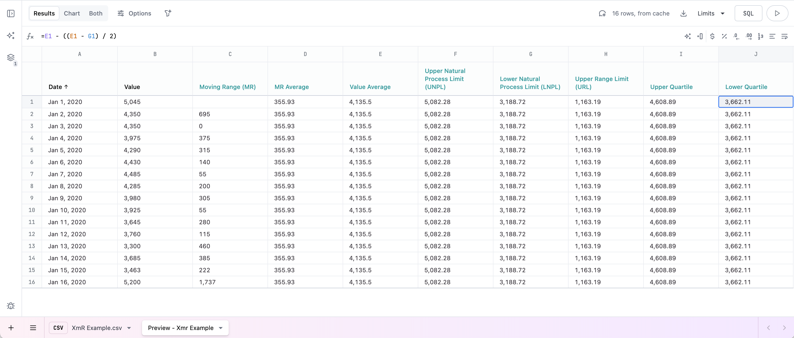
Below are the formulas for the calculations you’ll need. The spreadsheet references are based on the column order above. For more details on the math, refer to original website ![]() .
.
- Moving Range (MR)
=ABS(B2 - B1)Enter this formula in cell C2. - MR Average
=AVERAGE(C:C) - Value Average
=AVERAGE(B:B) - Upper Natural Process Limit (UNPL)
=E1 + (D1 * 2.66) - Lower Natural Process Limit (LNPL)
=E1 - (D1 * 2.66) - Upper Range Limit (URL)
=3.268 * D1 - Upper Quartile
=(F1 - E1) / 2 + E1 - Lower Quartile
=E1 - ((E1 - G1) / 2)
3. Build the X plot
Switch over to the Chart display and open the Options panel to get started building the X plot.
- Change the chart type to Lines
- Put
Dateon the X-axis - Put
Value,UNPL,Upper Quartile,Value Average,Lower Quartile, andLNPLon the Y-axis - Remove any fields from Color
- Apply styles to each of the lines. In my example, I attempted to mimic the styles from the original site.
You should now be able to compare your chart to the sample chart on xmrit.com to verify you’ve got the correct calculations.

Some other optional details to clean up your visualization:
- remove the fields not used in the X plot from the tooltip
- update the formatting for each calculations so the values in the tooltip are easier to grok
- adjust axis labels and hide the legend
4. Build the MR plot
Since we have all the data we need in the X plot tab to also chart the MR plot, duplicate the tab and adjust the visualization as follows:
- Put
Moving Range (MR),MR AverageandURLon the Y-axis and remove all other values - Apply styles to the new lines
Again, you’ll probably want to update the tooltip and check the value formatting for the fields in this chart.

5. Applying to your own analyses
If you’ve got all the calculations working in your example, you should now be able to use the same pattern for your own analyses, replicating the calculations and styling as fits your reporting.
You can then put these to charts, the X plot and the MR plot, on a dashboard together for analysis.

6. Segmenting the data
On xmrit.com they have a way to add a “divider” to the charts to segment the data to before and after a specific date. This is fairly advanced, and a bit tricker in Omni. Here’s how I was able to accomplish:
-
Include a calculated column that refers to a specific date in the data set, for example
=A$7 -
Create 2 columns, one with all of the values before the specific date, and another with all the values on or after that date. Here’s how I did it:
- Value before
=IF(A1 < C1, B1, "") - Value after
=IF(A1 >= C1, B1, "")
- Value before
-
Replicate all of the above calculations (
MR,MR Average,Average,UNPL,LNPL,URL,Upper Quartile,Lower Quartile) for both of those columns. That’s 16 total calculations so label well!
 -
When you create the chart, you need to include full range of values plus all of the before and after calculations you created in step 4.

It’s a lot to move around and keep straight, but the end effect will be something like this, where you can visually see the gap between the 2 ranges:

Let me know if you have any tips to improve or if I got any of this math wrong ![]() … and please feel free to share any cool charts or patterns in our community.
… and please feel free to share any cool charts or patterns in our community.