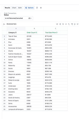
If you have a dataset with multiple measures (and no dimensions in the pivot) and want to plot them on a dual-axis chart in the same visualization but faceted, here’s a trick for you.
Step-by-step instructions
- Prepare a dataset with multiple measures,
Order CountandTotal Sale Price. - Select
Options→Swap rows and columnsto transpose your dataset to work better with the faceting approach - Toggle to
chartthe data. Select the bar chart visualization type.-
Add
Measure Nameto theRowsorColumnsin theSmall multiplesvis configuration section. -
Add the
Measure valueto the Left axis. -
This will result in multiple plots per measure on the rows or columns (whichever you choose).
-
By selecting the
Small multiplesoptions, you’ll have the option to select independent axes.
-


