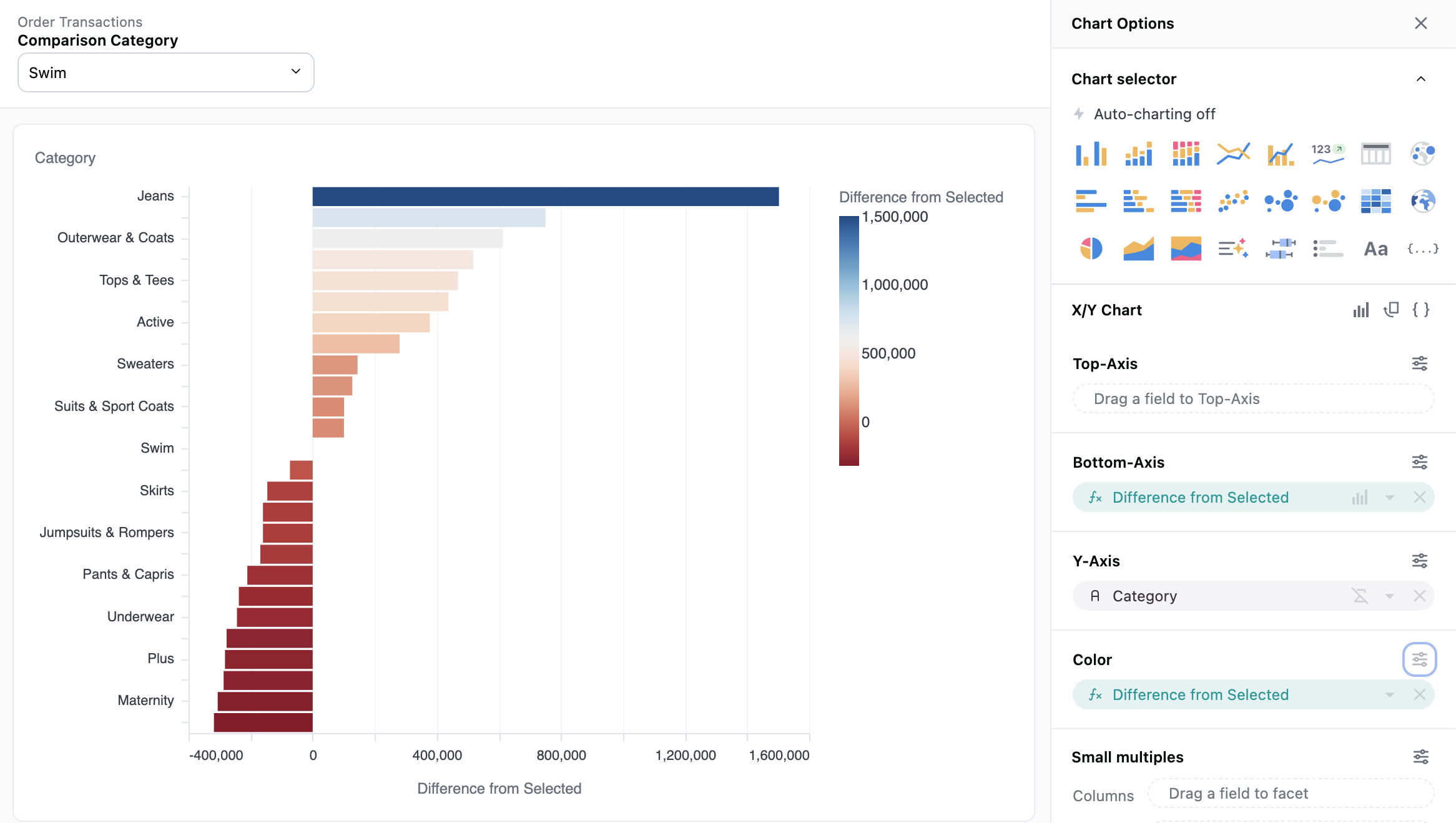
A comparative sales analysis provides a quick visual way to benchmark or compare metrics across key business dimensions. We would like an output like this, where the Comparison Category serves as the basis against which all other categories are measured:

Approach - Use Level of Detail (LOD) fields
-
First, determine what dimension and measure will define your analysis. In this example we use total sales grouped by product category.
-
Next, we need to create a “comparison” category - in other words the category selected by the user against which to benchmark all others. For this step we need to go into the IDE to define a filter-only field (this is the only step that isn’t possible through the UI yet). In the view file, we define a filter field called
comparison categorythat will be a single-select dropdown suggesting from the existing categories.filters: comparison_category: type: string suggest_from_field: omni_dbt_ecomm__products.category filter_single_select_only: true -
Back in the workbook, we can now define a dimension called
Selected Salesthat returns the sale price for only rows of the selected category.
Here is what this field looks like in the model file:#dimensions selected_sales: sql: | CASE WHEN ${omni_dbt_ecomm__products.category} = {{filters.omni_dbt_ecomm__order_items.comparison_category.value}} THEN ${omni_dbt_ecomm__order_items.sale_price} ELSE 0 END label: Selected Sales -
We now create a Level of Detail field that sums this
Selected Salesdimension but excludes the Category. In other words we want the total sales from the selected category to appear in every row, independently of how each row is grouped.
Here is what this field looks like in the model file:selected_sales_level_of_detail: sql: ${omni_dbt_ecomm__order_items.selected_sales} label: Selected Sales LOD group_by: aggregate_type: sum always_exclude: [ omni_dbt_ecomm__products.category ] -
Now we can build the final query using these fields:
-
Comparison Categoryas the filter only field at the top -
Category- this is the original dimension -
Selected Sales LOD- the newly created field that sums up the total sales for the selected category -
Total Sale Price- the metric we want to compare -
Difference from Selected- a simple excel calculation defined by subtractingSelected Sales LODfromTotal Sales Price
-
-
Now we have everything we need to create the graph, using the
Difference from Selectedas our metric driving both the x-axis and the color scale!