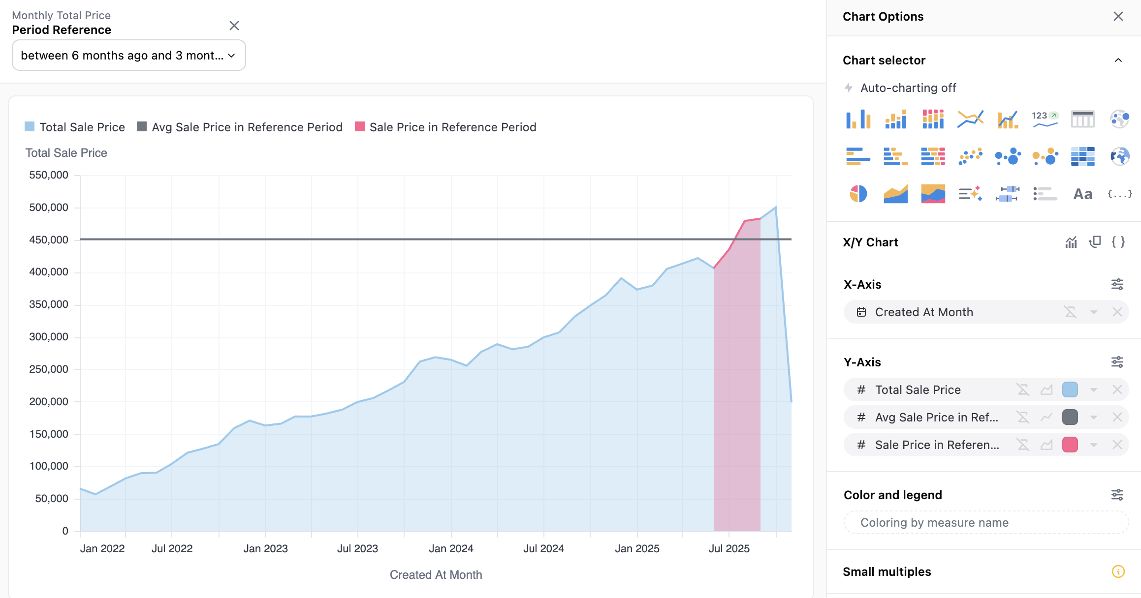
This Level-of-Detail example walks through creating the following analysis, where a user-selected time period serves as the benchmark against which to compare a different time period. For example, in this screenshot we can see both the average during the 12 to 9 month-ago period, as well as how sales have compared to that average across the entire time frame.

Here is how to build this:
- Select the base metrics you need, in this case the
Created At DateandTotal Sale Price. - Create a filter-only field to be used as the user selection - here I called it
Period Reference
filters:
  period_reference:
    type: timestamp
- Create a next metric for
Sale Price in Reference Periodthat returns only the sale price when the query dates are within the selected period.
sale_price_in_reference_period:
    sql: |
      CASE WHEN ${monthly_total_price.created_at_month[date]} >= {{filters.monthly_total_price.period_reference.range_start}}
      AND ${monthly_total_price.created_at_month[date]} <= {{filters.monthly_total_price.period_reference.range_end}}
      THEN ${monthly_total_price.total_sale_price}
      ELSE NULL END
    label: Sale Price in Reference Period
    format: USDCURRENCY_2
-
Use this field to create a level of detail field that averages
Sale Price in Reference Period.
-
We now have the necessary fields to build the first chart, using the
Total Sale Priceas the area chart, the LOD field as the average line, and theSale Price in Reference Periodas the overlayed red area. -
To build the second chart, duplicate the tab and calculate a simple percent difference calculation. This can be done using Excel as below, or via the
+Add Fieldbutton and the drag and drop SQL box. -
Finally, plot this
% Diff to Period Avgagainst the date field. When saving this to a dashboard, make sure to add thePeriod Referenceas a dashboard-level filter, and you’re done!