If you’re wanting to make data standout with differing colors when it is over a certain threshold to alert your dashboard viewers to certain important pieces of information, you can easily do this with the visualization builder tools built directly into Omni!
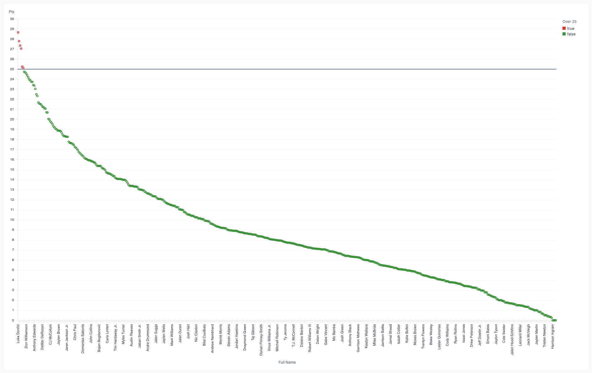
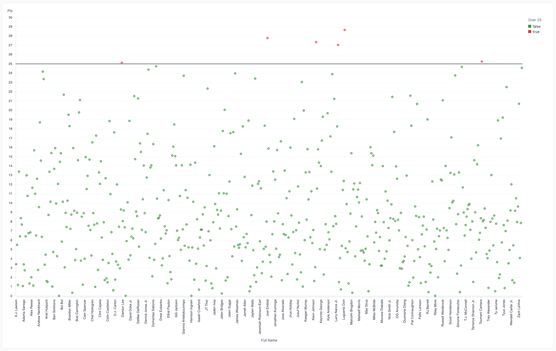
See how this is done in 3 minutes with our fun NBA data set!