
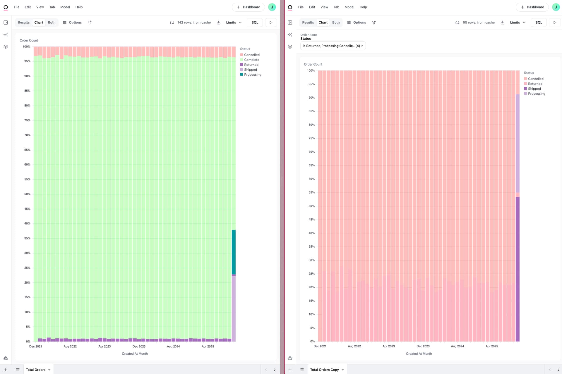
When a chart looks “right” in the workbook but “wrong” on the dashboard (or two dashboard charts disagree), the most common root cause is that the dashboard context (filters and controls) is changing the query. The fastest way to see exactly what the dashboard is running is to open the tile in its dashboard context, then compare it to the base workbook query.
Step-by-step workflow
- Explore the tile from the dashboard
- On the dashboard tile, click the three dots (…) and choose Explore. This opens the chart in a new workbook with the same configuration as the dashboard, i.e., the same filters and controls apply.
Tip: When dashboards have many filters/controls, exploring from the tile can be quicker than validating filters individually.

- Compare to the base query in the workbook (If comparing two dashboard queries, repeat step 1 then skip to step 3)
-
On the same three dots menu form the dashboard, choose Edit in workbook to open the underlying query in its workbook tab. This shows the “base” configuration without any dashboard-level changes.
-
Put the two views (Edit chart vs Edit in workbook) side-by-side and compare:
-
Selected fields/measures
-
Time grain (e.g., day vs month)
-
Pivots
-
Filters
-
Controls
-
- Check dashboard filters and their mapping
-
Dashboards support global filters. If a filter is expected to affect a tile, make sure it is actually mapped to that tile. Tiles that aren’t mapped won’t inherit the dashboard filter selection. The docs note that filters can be mapped to tiles (even hidden tiles) so they update with the dashboard filter selection.
-
If a tile seems unaffected by a dashboard filter, it’s often because the filter wasn’t mapped to that tile.
- Check dashboard controls (dynamic fields/parameters)
- Controls can change which fields a tile queries, effectively changing the SQL behind a visualization. If a control (e.g., timeframe selector, field swapper) is set differently on the dashboard than in the workbook, the queries will differ.
- Resolve and standardize
-
If the dashboard context (filters/controls) is introducing differences you don’t want, either:
-
Align the dashboard: adjust filter mappings and control settings so the tile matches the workbook’s intent, or
-
Align the workbook: incorporate the intended filters/controls into the base query so dashboard and workbook run consistently.
-
-
Use Edit chart (dashboard) for changes you want to apply only on the dashboard; use Edit in workbook for base-query changes you want everywhere.
Quick checklist for “why does it work in the workbook but not on the dashboard?”
-
Open Edit chart on the dashboard and verify:
-
Are dashboard filters mapped to this tile?
-
Are any dashboard controls (metric/timeframe/field swapper) changing selected fields or grain?
-
Is the chart’s time grain/fields/pivots different from the workbook version?
-
-
Pro-tip: Run both queries without cache to ensure data freshness.